Accessible by Design,
Compliant by Default
Complete set of accessible, responsive UI components following WCAG 2.1 Level AA guidelines and European Accessibility Act (EAA 2019/882) requirements. Built specifically for government and public sector digital services across Europe.
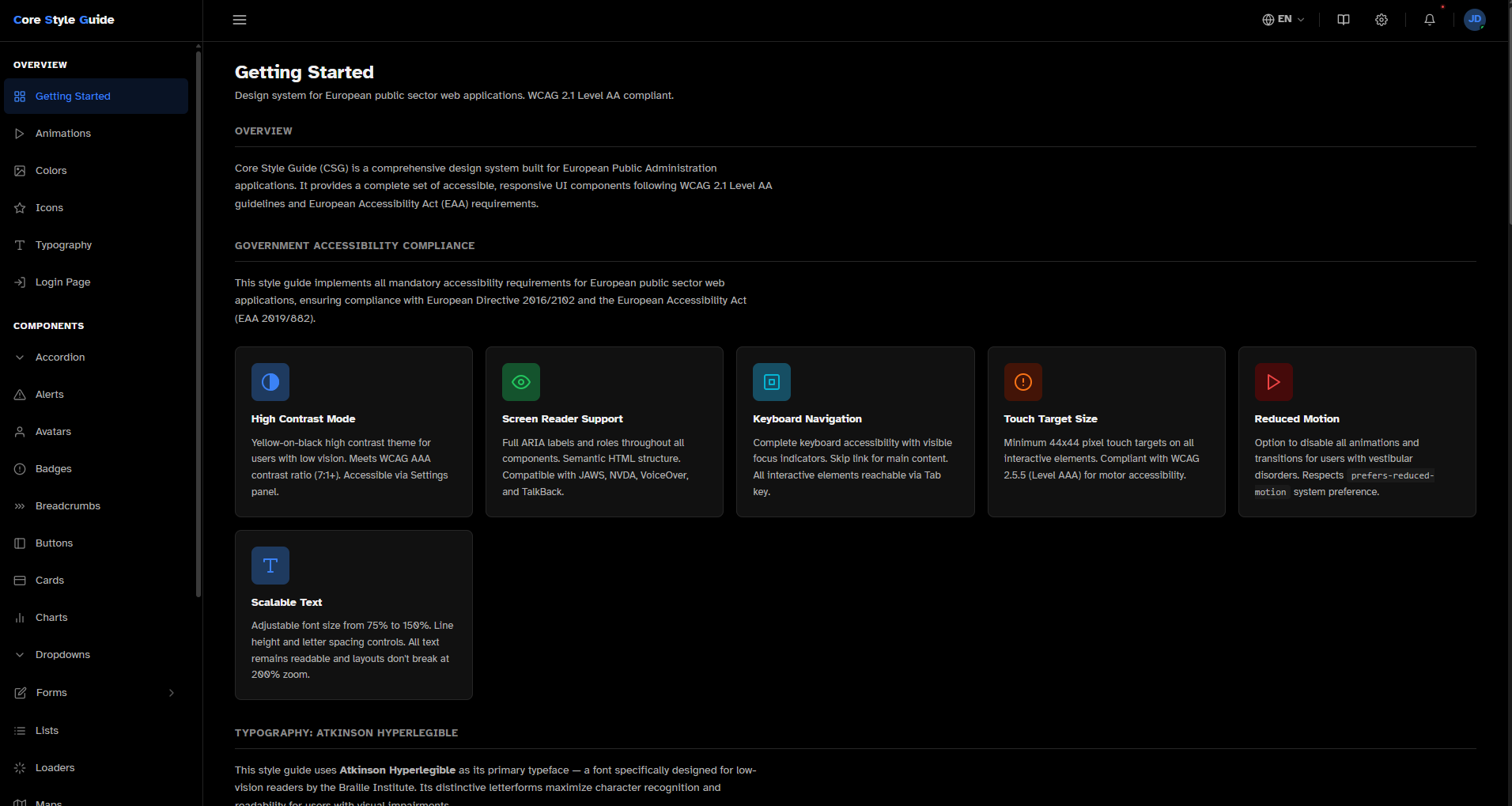 Dark
Dark
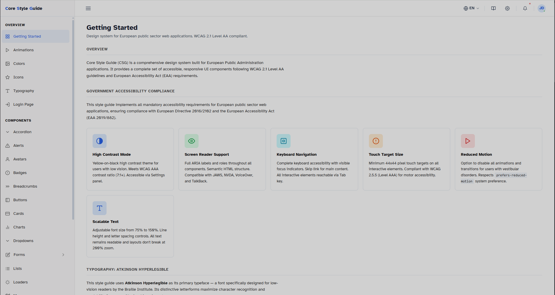 Light
Light
Government Accessibility Compliance
Implements all mandatory accessibility requirements for European public sector web applications under EU Directive 2016/2102
High Contrast Theme
Integrated high contrast theme with yellow-on-black color scheme for users with low vision. Meets WCAG AAA contrast ratio (7:1+). Togglable via Settings panel, persisted across sessions.
Built-in Screen Reader
Integrated screen reader with play, pause, forward and backward controls for page content narration. Full ARIA labels and semantic HTML. Compatible with JAWS, NVDA, VoiceOver and TalkBack.
Keyboard Navigation
Complete keyboard accessibility with visible focus indicators. Skip link for main content. All interactive elements reachable via Tab key.
Touch Target Size
Minimum 44x44 pixel touch targets on all interactive elements. Compliant with WCAG 2.5.5 (Level AAA) for motor accessibility.
Reduced Motion
Option to disable all animations and transitions for users with vestibular disorders. Respects prefers-reduced-motion system preference.
Scalable Text
Adjustable font size from 75% to 150%. Line height and letter spacing controls. All layouts remain intact at 200% zoom.
Atkinson Hyperlegible Font
SP CORE uses Atkinson Hyperlegible as its primary typeface — a font specifically designed for low-vision readers by the Braille Institute. Its distinctive letterforms maximize character recognition and readability for users with visual impairments.
User Display Settings
All accessibility preferences are centralized in the Settings panel. User preferences are persisted in localStorage and applied across all pages.
Complete Component Library
Over 20 production-ready modules — from foundational design tokens to complex interactive components
Foundation
Components
17 modulesForms
Built for Production
SP CORE is built with zero dependencies, vanilla JavaScript and a clean BEM-based CSS architecture. Designed for seamless integration into any existing project.
.csg- prefix
[data-theme]
Browser Support
Tested and supported on all major browsers (last 2 versions).